This is a great activity to do with Middle Schoolers. I asked them to bring in a magazine, only guidelines were, they need people on it and it needs to be age appropriate.
We have large sketchbooks and we used them for this project, starting with sectioning the page in 4. I asked them to measure well and have well aligned frames and 4 rectangles the same size. There is a lot of math in Art, that is my mojo.
The first section is called “no restriction”; here students will copy as look alike as possible the picture of the person they choose in the magazine. Give about 15min for this. Remind students to keep the eyes on the magazine most of the time, not on their sketch.
The next section is called “straight lines only”. We will start adding brain challenges, here we need to copy the drawing but we will limit ourselves to using only straight lines. Give 10min for this space.
The next section is called “Continuous Contour Outline”, and once we start drawing (the same person) we will not lift the pencil from the paper. This means the whole drawing is only ONE very long line. Give 5min.
The last space will be a “blind sketch”. Here we will NOT look at the sketchbook at all. Our eyes will be on the magazine 100% of the time, and the magazine needs to be far away from the sketchbook. This was the kids favorite, they laughed so much at their Picassos. This is the fastest sketch, give another 5 min.
If the frame was made in advance, this would fill a 45min class. But measuring the frame takes awhile for some students, I usually do on a different day, when the kids are finishing up other projects.
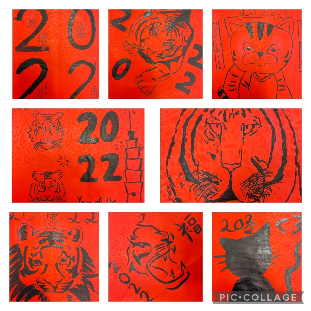
Look no further, here you have ideas to have your students busy with Chinese New Year Themed Art Projects!
We have been busy from Pre Kinder to Middle School creating CNY themed artwork. The upcoming year is the year of the Tiger, so we have all sort of Tiger projects decorating our walls.
My youngest students from Pre Kinder made the cutest cartoon style Tigers:
This was simple to put together, and students have been great at learning to listen before working (quite a challenge at their young age and painting supplies in their hands!). We did a directed sketch, first we outlined (pencil) a simple oval shape for the head using a stencil and added two lines for the tiger body as well as two ears in the sides of the head. Once the outline was done, we painted with warm colors the tiger shape, let it dry and then we painted leaves using cool colors. Once all was dry, we outlined the Tiger shape with a black marker, and I directed them step by step on how to make a simple yet cute face, and then they added the stripes. To add a more finished touch, we used green crayons to outline and add detail to the leaves we painted previously. They look adorable!
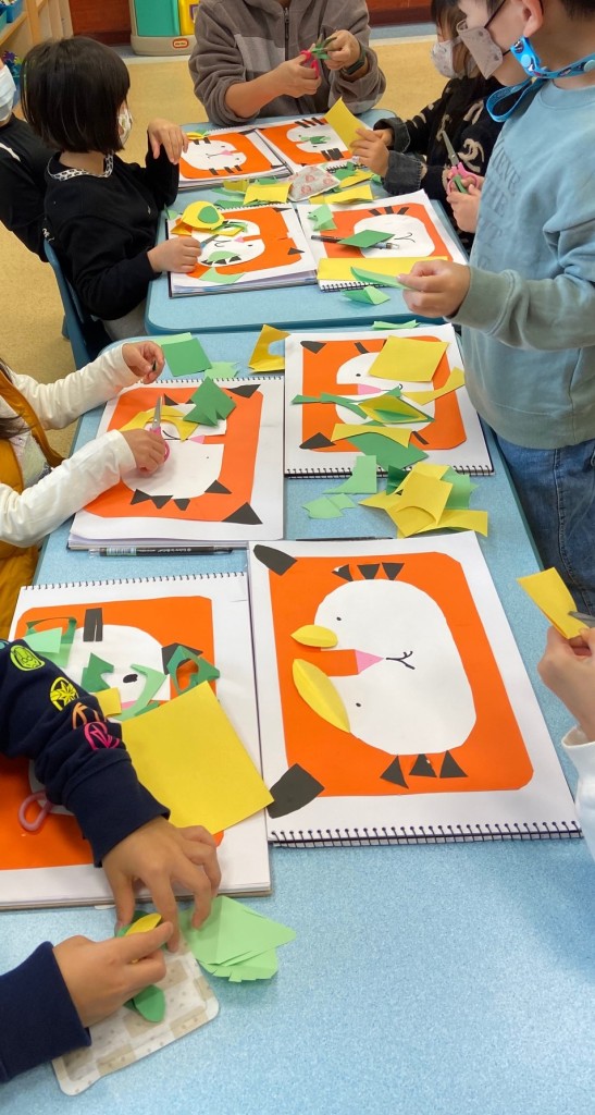
Kindergarten students made a Tiger Collage. They got stencils and different colors of paper (construction paper). They were busy for 2 classes cutting and assembling they lovely Tigers. They added the eyes and mouth using a black marker. The picture below shows the half way through project, they were adding leaves around the face using both green construction paper and patterned paper.
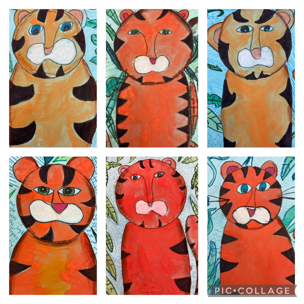
Grade 2 students made a similar version, with a more sophisticated Tiger. I directed a sketch (practice first in either a sketchbook or scrap paper) and then we redo on a light blue piece of cardboard. Proceed to outline the whole drawing with a black crayon, including the eyes; I asked them to leave a small circle in the middle of the eyes to resemble light. The crayons that you spiral up are user friendly, but any thin black crayon works for this wax resist. Once outlined, they painted the Tiger, using tempera disks, just make sure they add a lot of paint and not too much water, because the paper is blue; at this point do not pay attention to the stripes. The stripes were filled with a water based black marker and students then drew leaves with green oil pastels. I also handed them brown oil pastels to add a bit of shade on the sides of the body and head, as well as white and pink to fill in the nose and whisker area. On our last day I asked students to fill the empty space found on the blue paper, with any pattern they preferred using colored pencils, once the space was filled, they water colored the leaves (previously outlined with crayons). Loved this project!
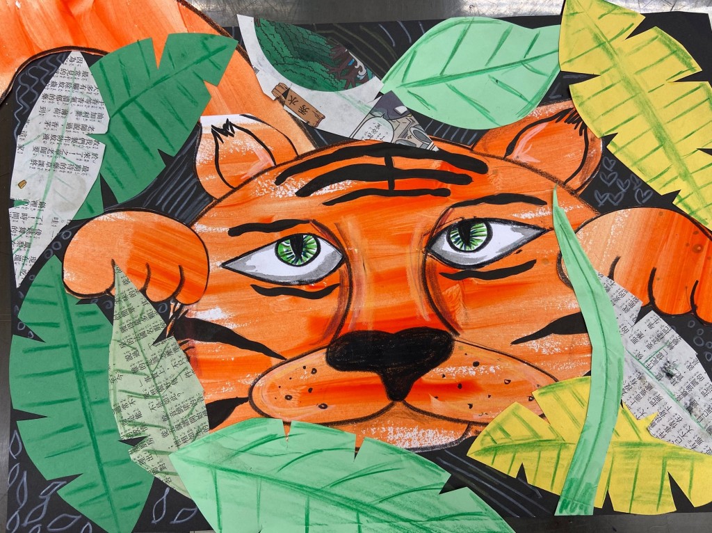
Grade 3 students made a mixed media Tiger. We started by painting 2 sketchbook pages with orange tempera paint. I specifically asked students to be rough as we wanted to see the strokes and some blank patches. We then sketched a yet more sophisticated Tiger in one page and a tail and two paws in the other, practice once in a different page or scrap paper, then move on to the painted pages. We outlined the sketch using black crayons and added eyes using white cardboard (draw, cut and stick). Make sure you cut on a folded paper so the eyes are symmetrical. We then cut many leaves using different types of paper: cardboard, construction, newspaper and/or patterned paper. I handed a black piece of cardboard to attach all the pieces we had cut, but I asked them to play with the composition first. Once all was well glued, we added detail using colored pencils, same as the project above, we filled the blank space (black cardboard) with patterns using a white color and added detail on the leaves using either black, brown, dark green or dark blue. They also added a bit of shading on the sides of the Tiger’s face and snout using brown colored pencils. Finally and super carefully, last day we added stripes using black Chinese Ink and a brush. We had the option to use dirty water (from the same ink and brush) to add a bit of gray around the white part of the eyes. Stunning!
Grade 4 students used a image transfer trick to make impressive Tiger sketches. Visit my pop art post to learn how to use this technique here.
We started with different picture of Tiger faces. Students selected one and proceeded to use the transfer trick (linked above) to transfer the outline of the features into natural colored cardboard. Once you have a sketch and you can see were the features are, use a black marker to outline both the eyes and nostrils. We then focused on darker and lighter areas (the picture were black and white so this was easy to identify) and used black or white oil pastels as needed to add as much detail as possible. Pay attention to the direction of the fur and it is a good day to introduce students to monochromatic drawing and different values of gray. Because we transferred the outline of the features and stripes first, the real looking Tigers look impressive on our windows. Last and final step was to add a bit of color to the eyes and a dot of white (using oil pastels) to mimic light reflection.
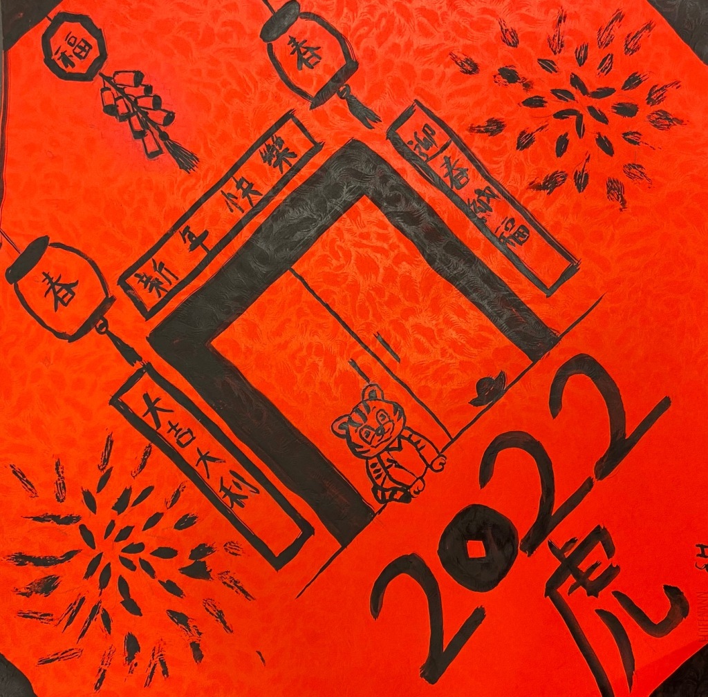
Grades 5 and up designed a traditional CNY poster. These are done on red paper and are painted with black Chinese Ink.
We always start planning and designing on our sketchbooks. This year I introduced them to the Design cycle and we talked about not getting stuck with one idea. I asked students to design 2 different posters in the sketchbook and then decide which they would use in the red paper. Choose a design and sketch with a pencil in your red paper; then very carefully use a brush and ink to paint it. Remind the students to work from down up, it is very common to end up with in in the back of the hands and then stain your posters.
These wonderful project could be done with kids from Grade 4 and up to High School. The pictures shown are from my Grade 4 students.
We used a simple trick to transfer an accurate outline of the animal’s features, and that makes a world of difference. The Pop Art Self-Portraits project uses the same trick.
Start with pictures of different animals, this project was done on light brown cardboard, so I went for brownish animals. I handed pictures of a cat, a tiger, an owl and a fox. I printed both a color copy and B/W copies. The color copies I placed in a plastic folder and plan to use them again in the future, but each kid got a B & W copy for their own use. Start by coloring the back of the B&W picture with a pencil, all of it. It should look all gray. Once that is finished, place the picture, right side up on top of the paper where your art will be, in my case brown cardboard as big as the pictures I handed. You can secure with a couple paper clips or repositionable tape, it helps. Once secured, trace the OUTLINE of your animal, making sure that all is well traced on top. Please refer to the Pop Art project to see pictures of this process. The eyes, irises, light reflection and snout are the most important features, once they are arranged accurately, the rest of the animal comes together in a flash.
I explained to the students that when we work with oil pastels, we work with the middle colors first and then we move to the light and dark shades. Using brown paper helps a lot, as it is the middle color for all of the animals I chose, they needed to observe the color picture and work with the lighter / darker colors, making sure to refer back to the color picture as they work. They should also follow the outlines they will find in their art paper (transferred using the “magic trick”). Kids were a little surprised with their finished animals, now and then I see them using the magic trick for other purposes, which I think is wonderful!
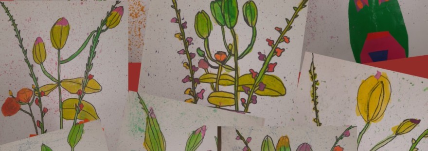
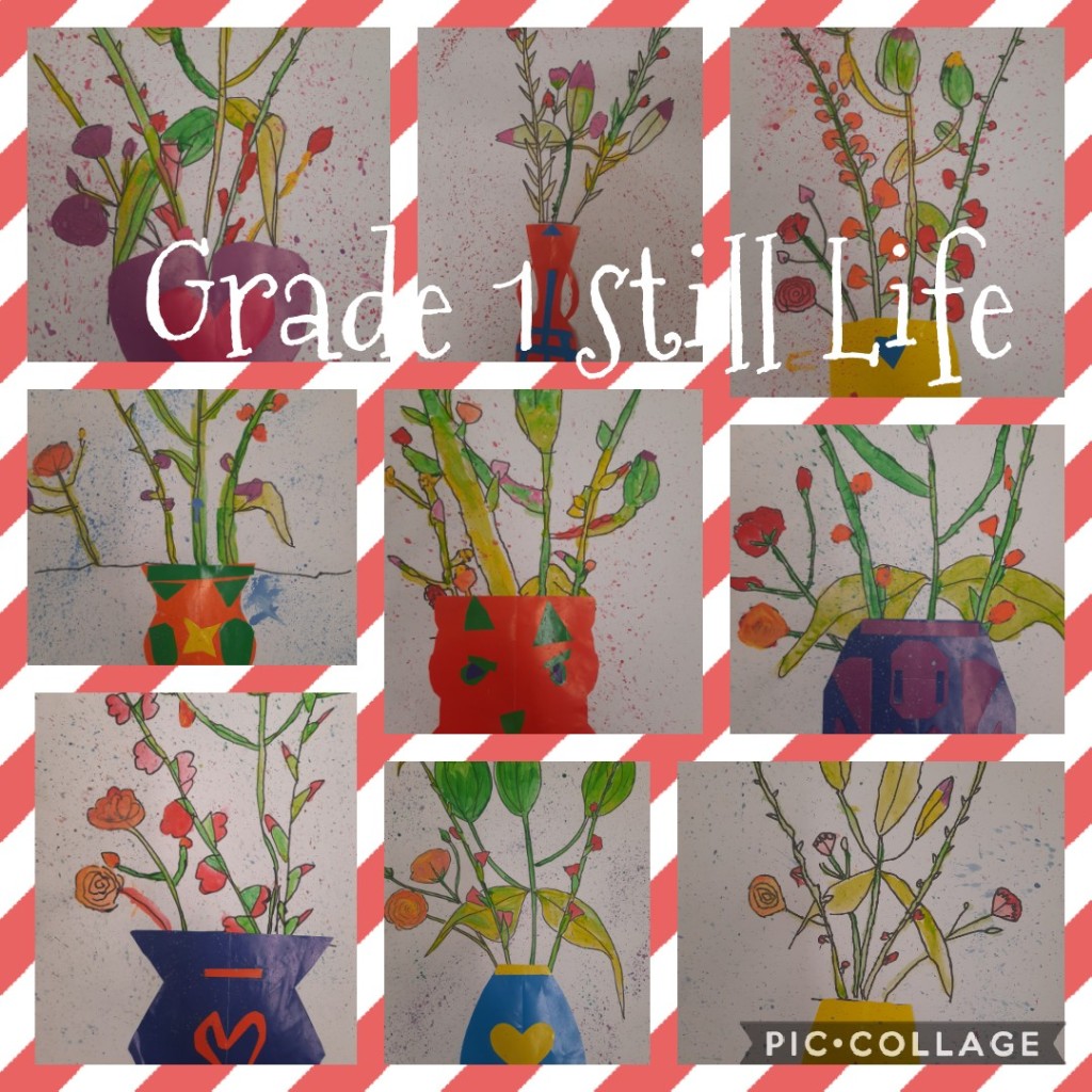
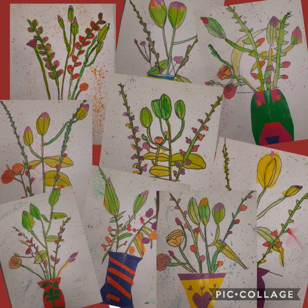
Every year I buy a bouquet of flowers and bring them to the classroom. There is something special about having fresh flowers around and I use them with most of my classes, from Kindergarten to Middle School.
My youngest students got a directed sketch, I was drawing the flowers myself, step by step and kids were observing and sketching their own flowers following me. I gave them A3 cardboard and asked them to put their fingers in the middle of the paper, then move the finger down a bit and make a small line (a small line a bit below the center). We made sure to start the stems from that line, nothing below, so we have space for a vase later on. Once the pencil sketch was finished (one class) we outlined them with a permanent marker, usually I give crayons to my youngest students, but this year I upscaled that and the artwork looked terrific. Once the outline was finished (another full class) we painted the stems and leaves. I like to use a double dip technique and tempera paint, meaning I put a green/yellow palette and ask students to dip in one color followed by a dip in a second color (no mixing), then they paint their stems and leaves carefully (we used small brushes) and when we have no more color, we double dip again using a different mix. I was a bit worried with my grade one students, as the stems were quite narrow, but they totally impressed me! Telling them that I trusted them with my good brushes and the paint helped a lot 😉
Next class I gave them a warm color palette (add white, it will bring lots of light to the flowers), and they used the same technique to color their beautiful flowers.
Finally, last lesson was on symmetry and they designed their own flower vases. I projected many different shapes of vases (google vase outline) and asked them to choose one. We talked about symmetry and a simple trick to make sure our vases would be perfectly symmetrical, we folded a piece of colored paper in half, designed half the vase (on top of the fold) and then cut out. When you open the paper (unfold it) you will find a perfectly symmetrical vase. I gave extra paper to add details on their vases, then asked them to glue them on top of the stems, some kids had a line traced with pencil, and they covered up the line with the vase. Once finished they could come to the front to splash paint using water, dry temperas and an old brush. BEWARE, kids love this part.
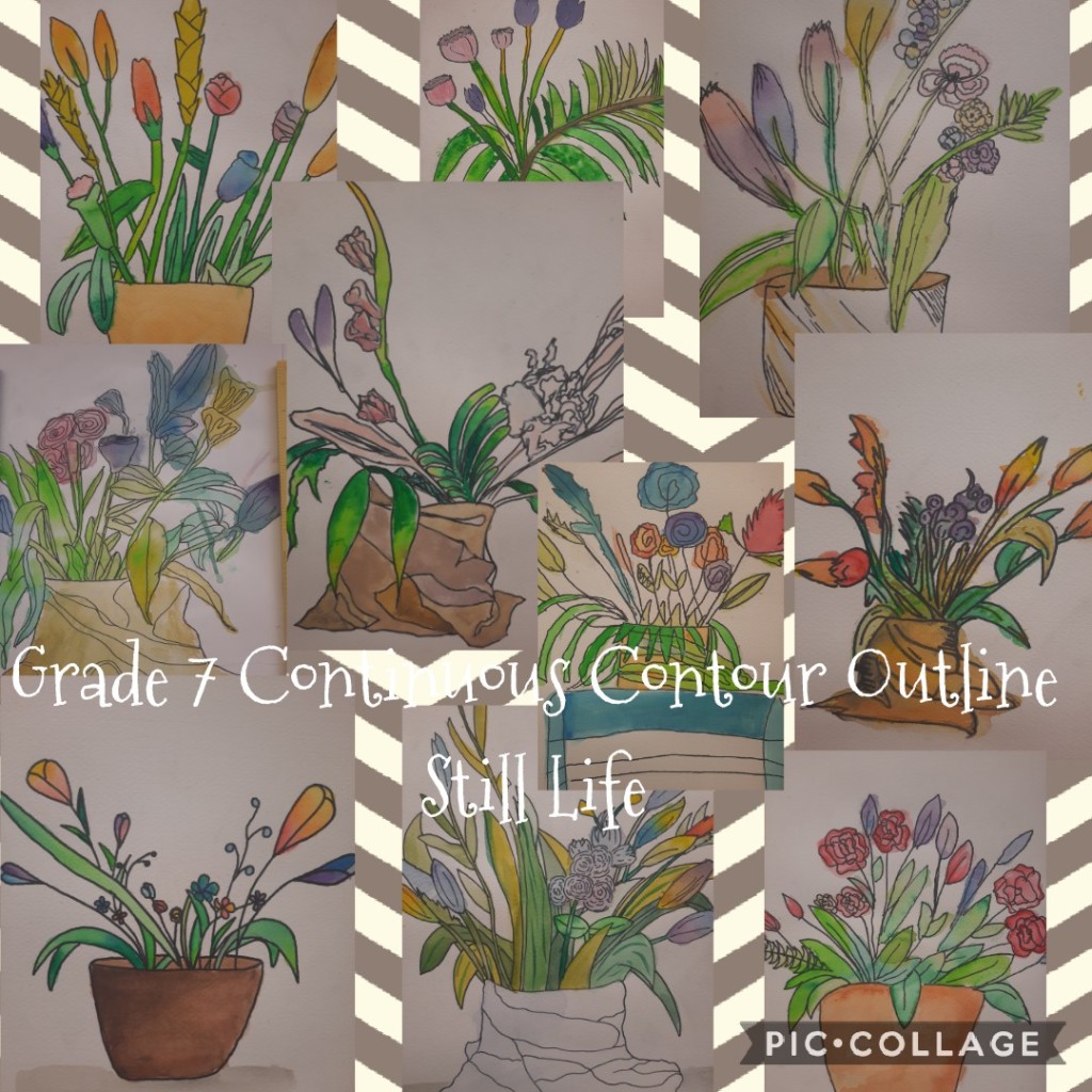
Older students got a different direction, I challenge them to use a continuous contour outline, meaning once they put the pencil down, it cannot leave the paper until they finish their sketch. Get ready to answer all sort of questions, like, can I go out and scribble on the desk and back to the paper? (as far as you don’t lift and clean up the mess, yes).
Once they finished up, they outline with markers, here they can omit lines if they wish, then erase pencil marks. I handed watercolors, not temperas, just to tweak it a bit, last year I asked G7 to use a double dip technique using acrylics.
This is a great budget friendly activity to expand your art activities.
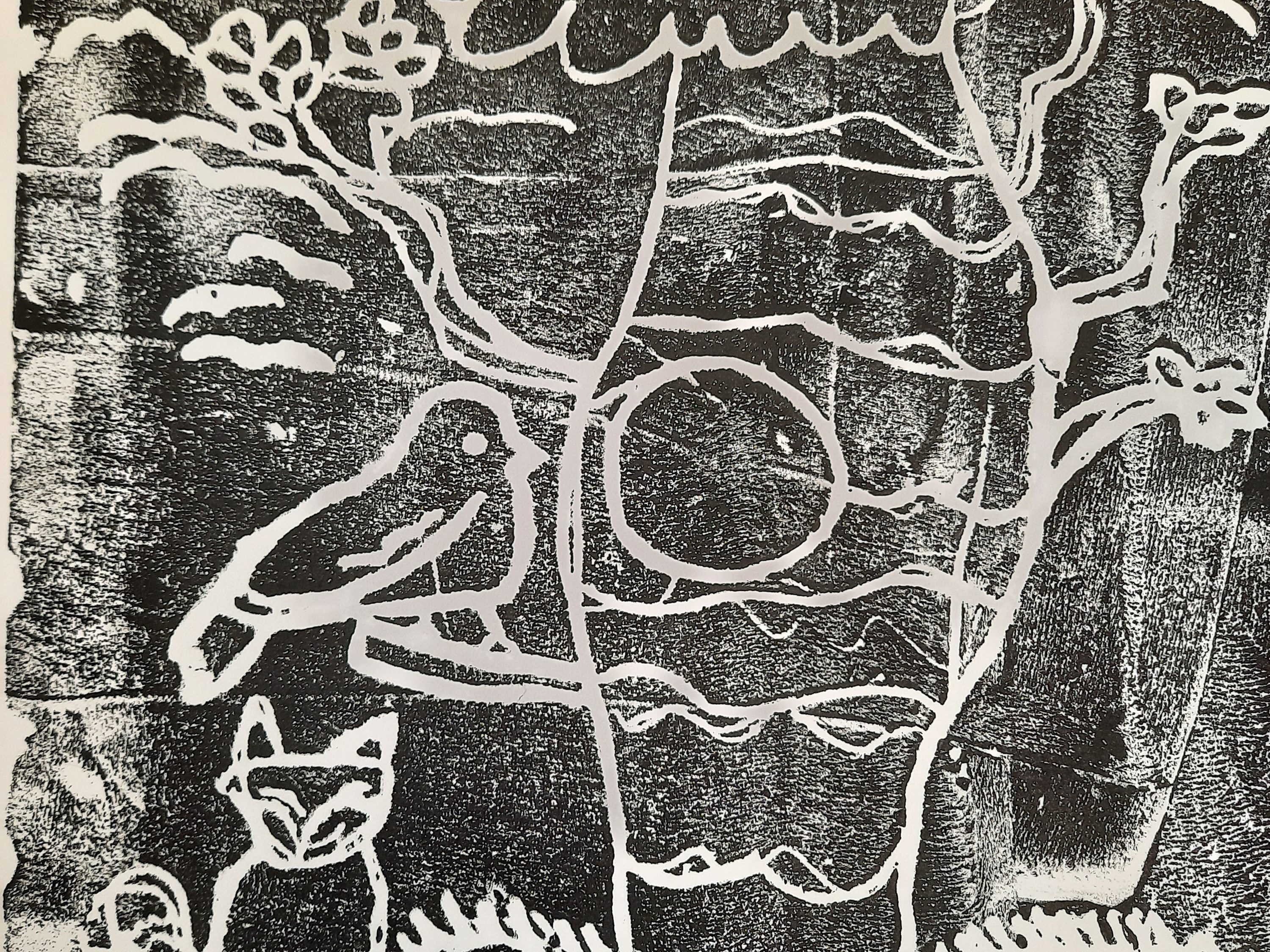
This is similar to the foil printmaking I posted recently, but this time we carved using real carving tools (which I found at a local store for like 2 dollars per kit) and a dull pencil. I was able to get sheets of Styrofoam for 1 dollar, I could cut out 2 of them and have enough for the whole class. You will need brayers and acrylic paint.
I first asked the students to design a simple and large drawing with lots of texture. Could be anything, a fruit, an animal, a landscape, a plant….anything, and I asked to design in the sketchbooks we use for planning (A4) and I previously cut out the Styrofoam the same size. I emphasized the use of different lines to add texture, and to think differently this time (say we need lines to represent the wind or simply to cover up the background). I made a sample myself, a tree, with wind on the sides and lots of grass in the ground floor, the tree itself was full of leaves. This helped the students realize they would need to add a lot of lines all over their design. Once we finished, I handed the Styrofoam and the carving tools, and asked them to make their drawing again on the Styrofoam (using a pencil) and then tracing harder with the tool they felt more comfortable with (in my case a simple pencil). We need deeper lines, but not too dip as to break the printing plates, my grade 4s where pretty good on this.
Once the plates were ready (do check, I had to send everybody back to carve harder) we took turns printing in a table I have set in the front. I handed a grid activity to the rest of the class so I could focus on 4 or 5 students printing at a time. Put a squeeze of a dark acrylic paint (black, red or dark blue work best) in a flat surface and smooth up up with a brayer, transfer the paint on the brayer to the printing plate, and cover all of the surface with paint. Put a white piece of cardboard on top and use a clean brayer to press evenly on top of the paper. Remove piece of paper as quick as possible to reveal a lovely print on the other side.
I found out that acrylic paint would dry incredibly fast and 3 students ended up with the paper ripping off when they tried to peel from the plate. I sent them to wash the plate and remove any piece of paper left. We then repeated and it worked well. Keep adding water if the paint feels too thick but not so much as to dilute the color, you want it as dark as possible!
This activity is great for doing things differently, and forcing kids to plan their work in a out of the box way, you really need to think “the other way around”, say, if you want your print to read HELLO, you need to carve the letters as if reflected in a mirror. Kids really enjoyed the process and they want to repeat. Hope it turns out well for you too!
This was one of the hardest lessons I have given to my students. I could feel the pain, but it was a wonderful learning experience, because I totally took them out of their comfort zone (me included) and explored new terrain.
There were many learning objectives in this lesson, the first one being composition. I started by choosing some landscape pictures online and putting a selection of 7 in a google spreadsheet, and asked them to sign up for one. There were forests, beaches and mountain views to choose from. I then printed out for them, as each student needed their own picture, I wanted them to focus on it all the time. We started by dividing our sketchbooks in 4 by using artists tape (masking tape works). I like to “damage the tape” before adhering it to the sketchbook by putting it on my clothes first, then it goes on the sketchbook, this will make the peeling off part easier. You need a frame around the sketchbook and then a cross dividing it in 4 equal parts. We then proceeded to make view finders, I handed scrap paper and rulers, and asked students to measure the rectangles in their sketchbook (all 4 should be the same size) and outline the same measurement in the center of the scrap paper (which was A4 paper cut in half). They cut out and ended up with a frame, the same size of our rectangles, and we will use the frame to find interesting views (composition) in our picture. This brings me to the next objective: the rule of thirds. You can read more on it here. You should play around with your frame until you find a good view, then proceed to outline that view with a pencil, very lightly. Do the same in the other 3 squares.
Once we have 4 views outlined, we can paint using watercolor, for which I gave only one simple direction, go from light to dark. Watercolor is different than acrylics or temperas, as we work in layers, starting with the lightest colors, then we add darker shades as we go, paying attention to where the dark spots are and the textures. This was completely new to my students, so it took a lot of trial and mistake, in the end I noticed that the ones that worked out best were:
a) fearless students
b) coachable students
No surprise uh? It was nice to peel off the tape and see (some) resemblance in our projects. Practice makes masters, enjoy!
Here is another idea to keep the student’s creativity rolling and is a perfect project to complete around Chinese New Year.
This upcoming year will be the year of the Ox and I printed out different images of bulls and cows (realistic, artistic, abstract, cartoon-like and cute) so everybody’s styles had something to be inspired with. I also used this opportunity to talk about balancing light and dark, check out my NOTAN project, which specifically teaches this concept.
Students first designed ideas on their sketchbooks, I am working with brainstorming rather than just designing one idea. I am forcing my students to draw different sketches before deciding for one, it is really working and I can see it becomes easier as we go. Once the design is finalized, I hand squares of bright red paper, where they transfer their final design and then, with a brush and black ink, trace on top.
This is an opportunity for the students to look for their favorite quote, and if they do not have one, to choose now.
What quote or phrase inspires you? How can you illustrate it?
I handed students working sheets to practice writing with pretty calligraphy, just print out alphabets found online using a light gray (lower down the resolution when printing) and ask the students to trace with pencils or calligraphy markers. Once they feel confident, they can practice writing their chosen quotes (if they do not have one, you can print out or project a bundle for them to choose) in a sketchbook or recycled paper. Once they are confident they can choose how to decorate their quote and move to their final paper (my middle school students are using watercolor sketchbooks, I found a local supplier selling large sketchbooks with great watercolor paper for 7 USD, a real deal), then worked on their illustration sketching with a pencil, then water coloring it. When the drawing was done, they wrote the quote with pretty calligraphy, using a pencil; we then used the ink mess to add color on that surface (use plastic folders and scribble randomly using markers, then add water with a spray bottle on top. Press on the surface where you want an ink mess). Let dry very well before tracing the quote with a marker.
This lesson plan can be adapted to any grade level and it is fantastic a fantastic way to exercise focus and spatial thinking skills.
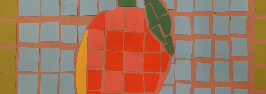
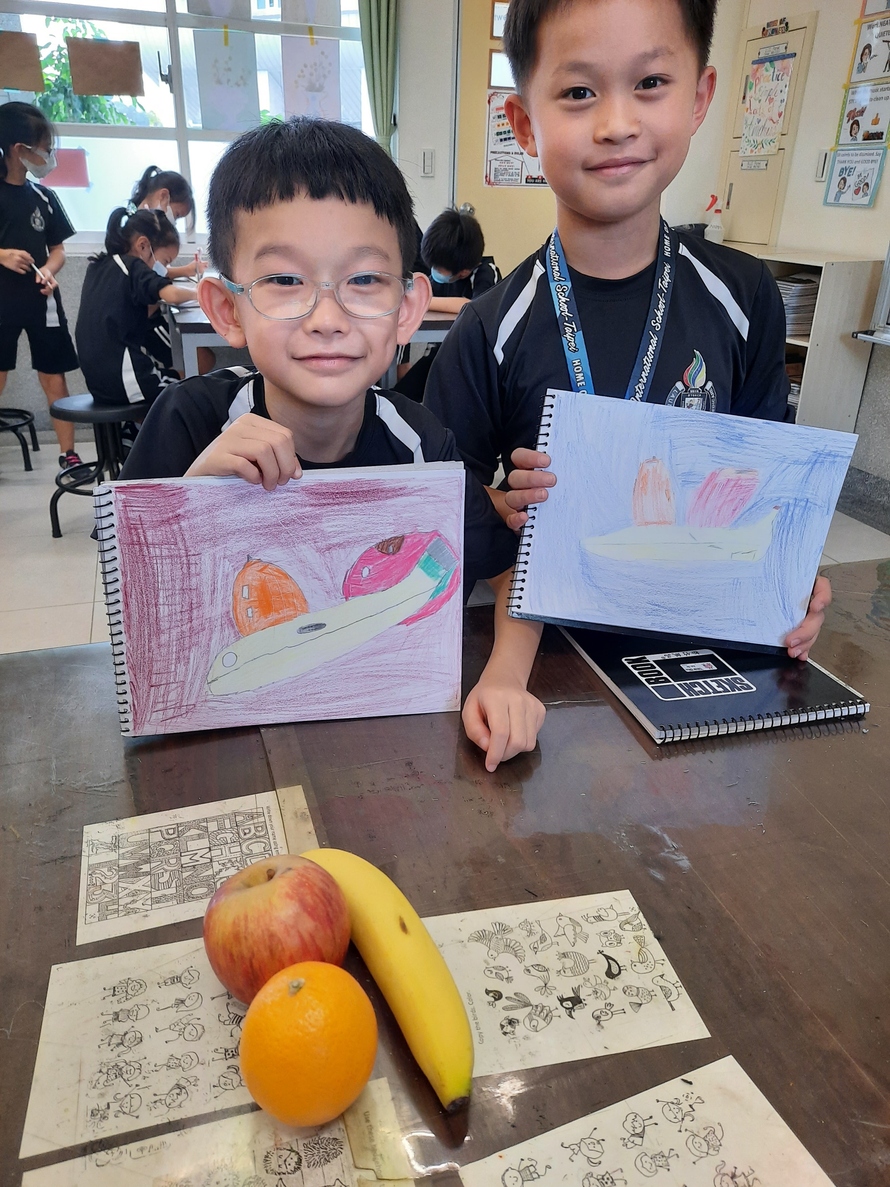
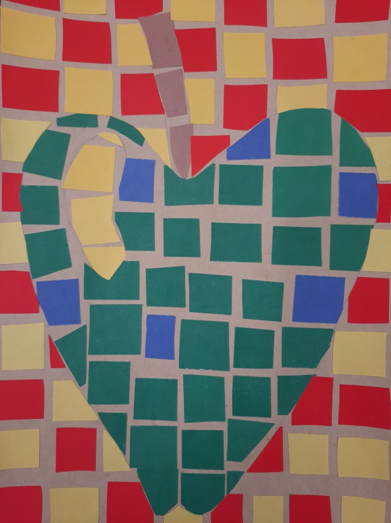
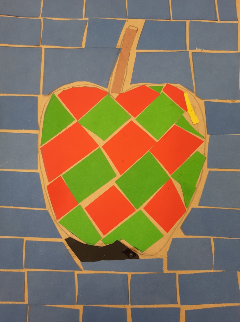
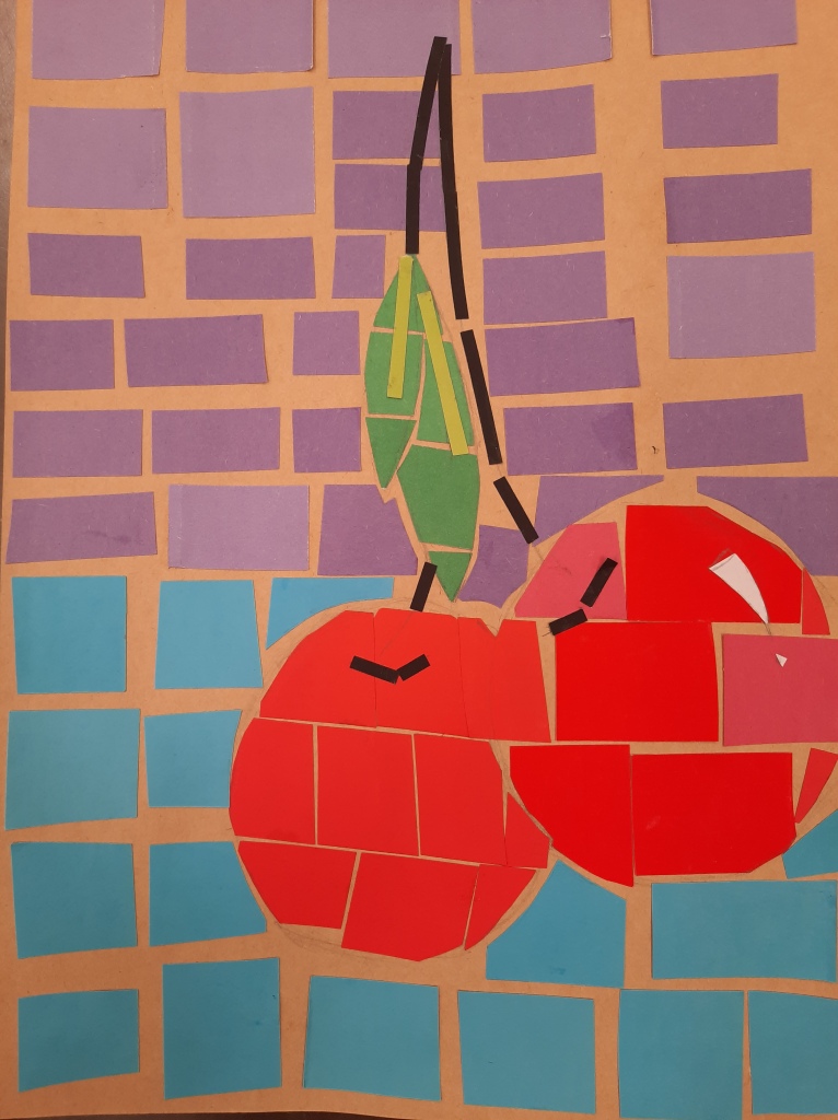
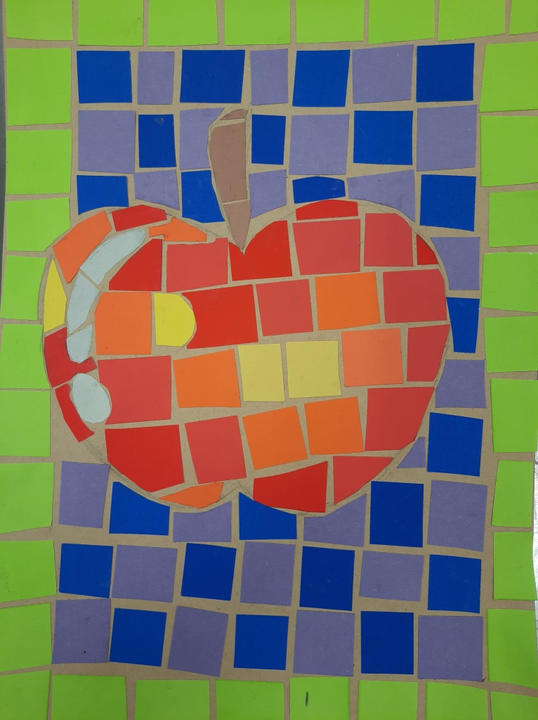
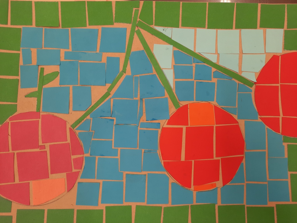
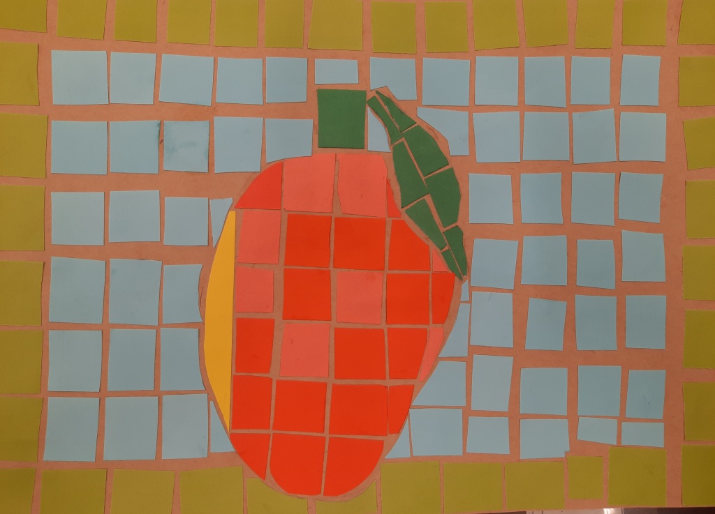
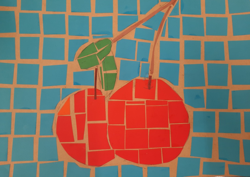
Sketching with real fruit helps students to pay attention to detail and enhances observational skills
One class I brought real fruit for the students to sketch. I asked to take not on the imperfections and light as they drew, once outlined they colored with coloring pencils; this step is not needed to make a mosaic but I like to do projects focusing on different angles. Next class we outlined a fruit, could be the one we choose last class or another one; I asked them to make the fruit filling most of the paper in this case it was a A4 sized cardboard. Once all of the students have their fruit outlined, I explained the basics of mosaics, basically we work with squares the whole time until we come into a space where the square does not fit, in that space, we use a pencil to trace where exactly should we cut the paper to make it fit, then cut and stick. When the fruit was done, I asked them to use a contrasting color for the background and continue filling the space in the same manner.
This activity, be warned, demands a substantial amount of patience, which makes it a great activity for the students, have you noticed the more screen time, the less patience they have?
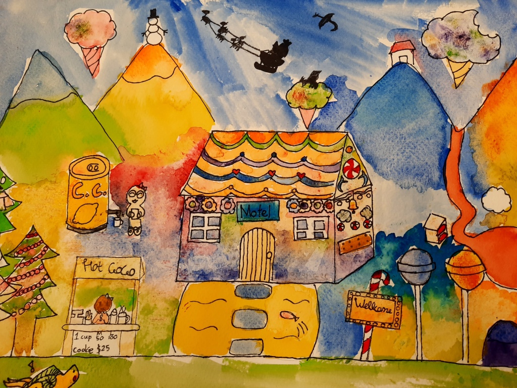
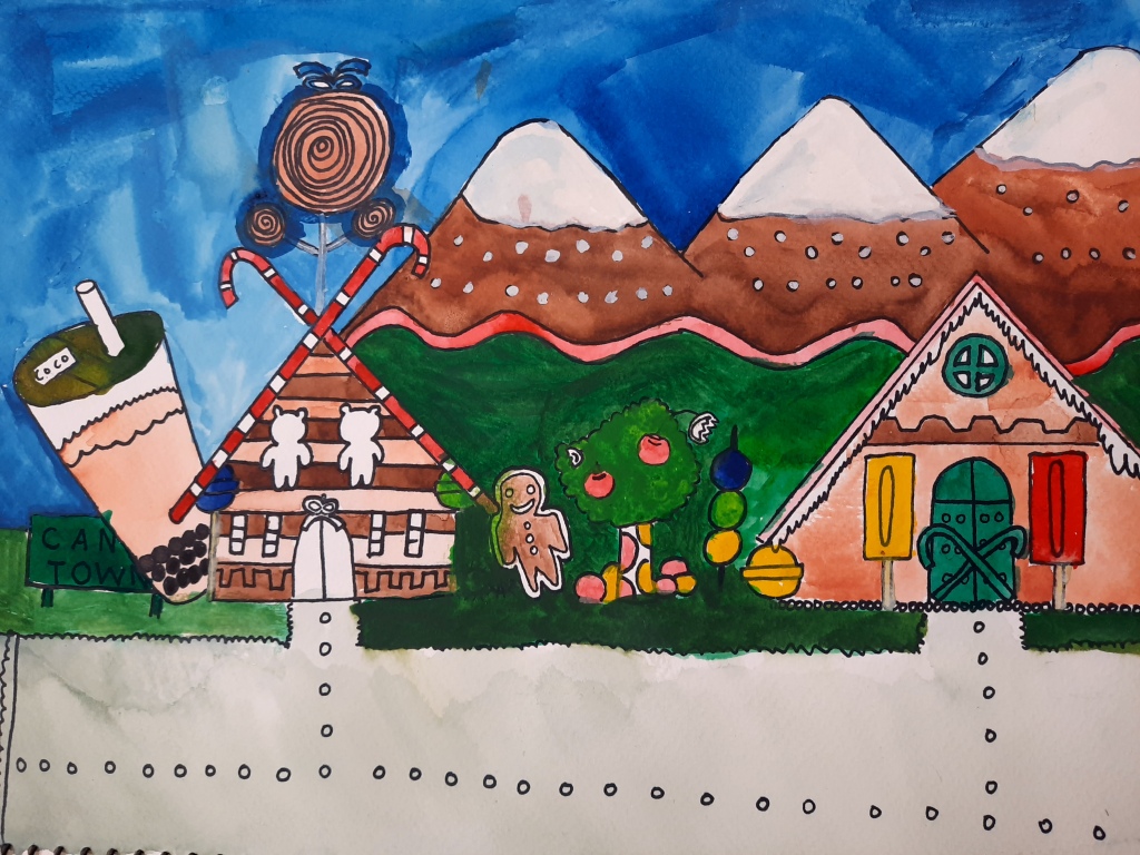
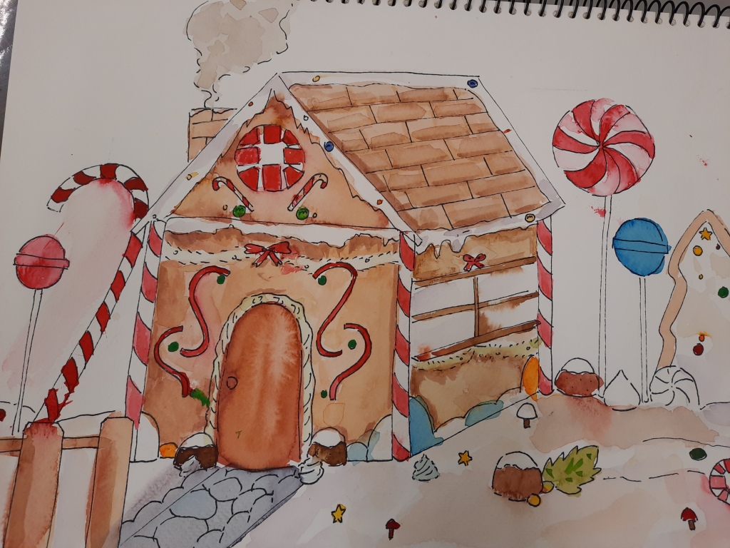
Students love to design, for this class I (early December) I asked them to design their own Gingerbread House.
I gave them a few guidelines:
Use a ruler, this way wobbly designs look well done and professional. Shapes could be as simple as they liked, but I asked them to make sure they were straight.
Use perspective, I reminded them of 3 sections in our landscapes, we have the background (usually the top of the paper or the sides), the middle ground (usually the center of the paper or between the center and the sides) and the front ground (found at the bottom of the paper or the center). Depending on their design, they should add 3 different sections, variating sizes to give the illusion of deepness.
I always remind to the students to sketch lightly so there are no erasing marks. Once the design was completed, they outlined with a permanent marker (ink, sharpie). I then gave them time to have fun with watercolors, my students are still learning and experimenting with them, I can see they are learning to adjust the right water to paint ratio and to control this runny medium as they go.
Some designs were very creative, I had a pirate boat (all made out of Ginger), a futuristic looking lake house, a House inside a water globe, a design transformed into a puzzle and so much more.